Back to website examplesFictional studio · Original concept
IDEA. LETTER. YOUR OWN EXPRESSION.Currently in blue.A little yellow today.

Gooddesignstands out.

We are MIMO. A small graphic design studio for big ideas. We give brands a face, words a rhythm and ideas a form.

Take a look at
what we mean.
TYPOGRAPHY,
WITH SOMETHING TO SAY.
01 / SELECTED CONCEPTS

Three ideas.
Three worlds of their own.

Original studies exploring what one good idea can do. Fictional projects, real work with form.

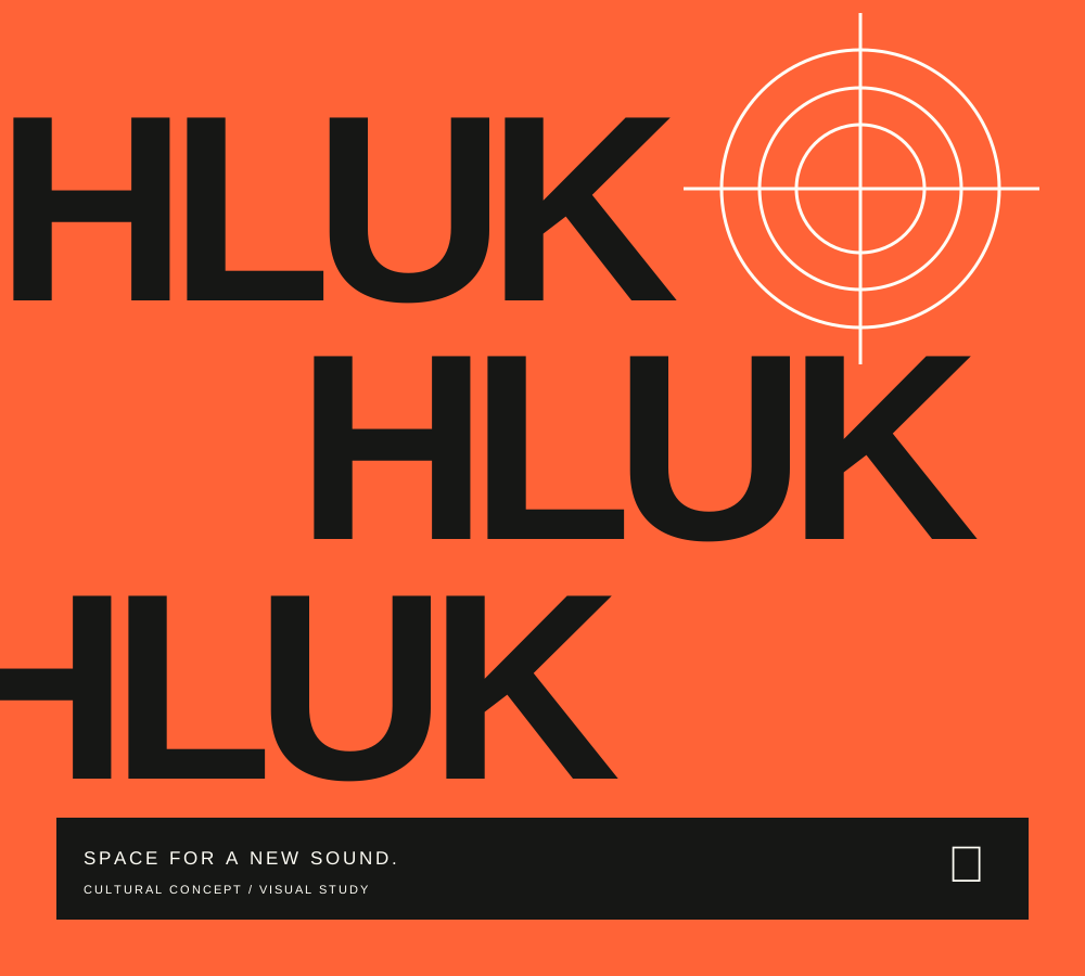
Original orange HLUK poster with repeated black lettering and a white circular graphic

Visual identity · Concept

HLUK

An identity unafraid to be heard.
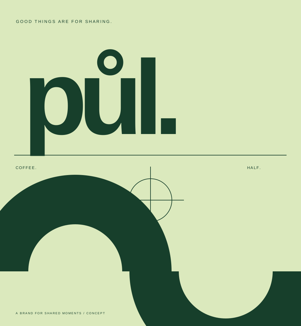
Green typographic study of the půl. brand, with soft shapes and two opposing semicircles

Brand & packaging · Concept

PŮL

A small brand. A great desire to share.
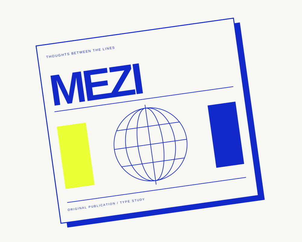
White and blue cover of the original MEZI publication, with a circular line illustration and a yellow detail

Editorial design · Concept

MEZI

Space for thoughts between the lines.

All three concepts were created for this example. They are not customer references.

02 / HOW WE THINK

First why.
Then how.
Finally wow.

Room for
your idea.

Good design does not have to shout. It needs to know what it wants to say. We start with questions, look for a simple idea and refine it down to the last detail. With a desire to stand out — when it makes sense.

03 / WHAT WE COULD CREATE

From the first line
to a character of its own.

01

A brand with its own voice

From the first name to the visual system. A logo is the beginning; character emerges from how everything works together.

Identity · Logotype · Visual language
02

Typography that leads

Letters, composition and rhythm. A poster, publication or package that has something to say and knows how to say it in its own way.

Poster · Typesetting · Packaging design
03

A digital first impression

A website as the natural continuation of the brand. Clear structure, its own visual identity and details that make sense.

Web design · Art direction · Concept
04 / YOUR MOVE

Something
on your mind?

↗

Let us give it a shape together.
This is where your own website begins.

Describe your idea The contact link leads to an enquiry
for the ‘A website without the worry’ service.
Concept HLUK — details

What could a brand for a new cultural scene look like? Loud typography, a simple mark and a rhythm that flows from the poster into the whole visual world.

The name becomes the main graphic element. Repeated letters create a rhythm; the circular drawing suggests the spread of sound.

Orange, almost black and a light detail. A limited palette and large lettering hold the identity together at any size.

Concept PŮL — details

A fictional café brand built on a simple idea: good things are for sharing. Friendly letters and semicircles that come together to tell a whole story.

The half motif connects the name, logotype and supporting graphics. The semicircles could be a cup, a sun or a place for another person.

Soft green contrasted with dark print. A visual system that could live on a coffee bag, cup or shop window.

Concept MEZI — details

A magazine study about what cannot fit into one sentence. A firm grid, generous margins and typography that lets the content breathe.

Tension between the fixed order of the typesetting and the free line illustration. Cobalt acts as a point of orientation throughout the publication.

A distinctive cover with a calm centre. A yellow accent highlights important moments without overpowering the reading.

ORIGINAL CONCEPT / 2026
Original orange HLUK poster with repeated black lettering and a white circular graphic
Original cultural concept
Visual identity

HLUK.

What could a brand for a new cultural scene look like? Loud typography, a simple mark and a rhythm that flows from the poster into the whole visual world.

One idea

The name becomes the main graphic element. Repeated letters create a rhythm; the circular drawing suggests the spread of sound.

Your own expression

Orange, almost black and a light detail. A limited palette and large lettering hold the identity together at any size.

Scope
Brand / poster / typography
Category
Fictional original concept
I have an idea of my own
ORIGINAL CONCEPT / 2026
Green typographic study of the půl. brand, with soft shapes and two opposing semicircles
Original café concept
Brand & packaging

PŮL.

A fictional café brand built on a simple idea: good things are for sharing. Friendly letters and semicircles that come together to tell a whole story.

One idea

The half motif connects the name, logotype and supporting graphics. The semicircles could be a cup, a sun or a place for another person.

Your own expression

Soft green contrasted with dark print. A visual system that could live on a coffee bag, cup or shop window.

Scope
Logotype / visual system / packaging
Category
Fictional original concept
I have an idea of my own
ORIGINAL CONCEPT / 2026
White and blue cover of the original MEZI publication, with a circular line illustration and a yellow detail
Original publication concept
Editorial design

MEZI.

A magazine study about what cannot fit into one sentence. A firm grid, generous margins and typography that lets the content breathe.

One idea

Tension between the fixed order of the typesetting and the free line illustration. Cobalt acts as a point of orientation throughout the publication.

Your own expression

A distinctive cover with a calm centre. A yellow accent highlights important moments without overpowering the reading.

Scope
Typesetting / cover / original graphics
Category
Fictional original concept
I have an idea of my own